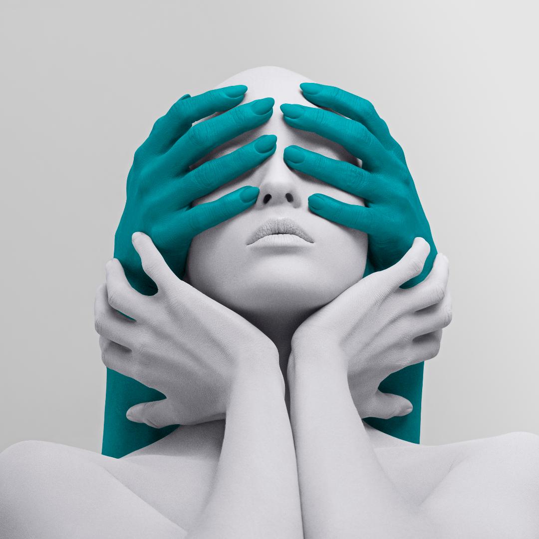
If you have ever seen photos of an Olympic athlete, you have no doubt seen Tim Tadder‘s work. As a photographer, he has captured the likes of Michael Phelps and Simone Biles. Recently, Tadder hosted an exhibition at Avant Gallery in New York City. 360 was given the opportunity to ask him about his artistic inspirations and his style.
How did you get into art? Was there a moment you realized you wanted to do art professionally?
I’ve always been involved in some capacity with art as a major thematic in my life. It was always what I most enjoyed in school, as a hobby, & just overall being creative. I left a career as a teacher and pursued photography as a craft and a creative expression form when I was 27, after realizing I needed to enjoy my occupation and creating was a massive part of that.
When did you realize art was the career choice for you? Was there a moment when you realized you were gaining recognition and success in the art world?
People see me as a highly creative photographer and artist. The way that I see the world has a particular point of view that is sought after. I think embracing that as who you are and what you do and how you perceive and see has value and therefore is a viable career once you can monetize that vision. Everything else falls into place from there.
People will collect and want to own a piece of your vision and hang it on a wall, which ultimately empowers you as an artist to continue to create and explore your vision knowing that you have the financial support in order to do so.
When ‘Nothing to See’ first was shared as large format prints, the response was overwhelming. It was at that point that I knew there was serious traction in a new marketplace, one that I had always dreamed of being a part of and was fortunate that this particular series of images was embraced by collectors and galleries.
How does knowing a multitude of art mediums help you with your artwork?
I come from a background of 20 years of creating advertising campaigns for the world’s biggest brands and our job is to create on demand art that sells a product. And in doing so, you learn to use all the tools at your disposal to make the most powerful image for that purpose. I have been able to use all of that skill and knowledge and channel it into my personal fine art work to create images that convey messages that are important to me and that should be heard around the world.
What do you look at to get inspiration to create?
Pre-COVID I attended a lot of art fairs and contemporary museums to look at trends, masters, & to find inspiration on how people explore visual presentation. I found that going to those events and seeing the art in person really helped me refine my message and refine my voice. In a COVID world, I try to follow artists on IG and Twitter who I’m inspired by and keep abreast of their new work and from there I try to find my own lane to blend out, be distinct, and be noticeable. Right now there’s so many rabbit holes that one can go down to find inspiration, whether it’s instagram or twitter or the NFT space.
You use bright and vibrant color schemes in your artwork, when and how did that start? What’s your process when deciding about the colors you will use?
I’ve always been attracted to bold use of color. It’s been a monochord in my commercial work since my career began. For me that’s an instinctual choice. To use bold colors to help story tell. In choosing, a lot of it comes from instinct and a lot comes from what those colors represent. For ‘Nothing to See,’ I chose the bed, black, & white hues because they were historically represented of fascist banners and that collection was born out of a desire to create iconic, anti-fascist imagery.
You photograph both still-lives (mostly mannequins) and people. Is there one you prefer to photograph? What led to you choosing a humanoid inanimate object as your main subject in many photos/series?
I choose to use real people and not mannequins. I select models that have very androgynous, mannequin-esque features because I want my images to represent humankind and not just a type of individual, which sometimes comes from casting talent with defining characteristics. It’s not a picture of someone, it’s a picture of something.
You edit with high contrast, high-saturation as your signature style. What drew you to this editing style?
Instinctive choices. It’s how I see, it’s how I visualize, it’s what I as an artist feel is beautiful. It wasn’t a choice to follow a trend, it was my own visual aesthetic.


